Introduction
This vignette presents the methodological foundations and the calculations performed by the {vizsurvey} package. As explained in the first vignette, {vizsurvey} is not meant to run statistical tests or to draw conclusions: it is above all an exploration and diagnostic tool, positioned between data collection and analysis in the GSBPM cycle.
The calculations carried out in {vizsurvey} rely on simple but robust measures, such as distances, ranks, standard deviations or relative gaps between distributions. These measures serve as visual cues to identify possible inconsistencies: abnormal variations from one wave to the next, gaps between interviewers, abrupt changes in distribution, or unexpected increases in the non-response rate.
All the functions used in {vizsurvey} were designed to be applicable to any type of variable, whether categorical (codes, categories, multiple-choice answers) or numeric (continuous values, durations, ages, incomes). The aim is to provide a generic, reproducible and robust computation framework that ensures the comparability of results across surveys and survey waves. Priority is given to the stability of the indicators and to the simplicity of the formulas, so as to make them easy to read and to adopt for field teams.
These methodological choices are not set in stone: they were progressively refined within Statbel, based on the first results produced by the interface. Feedback from survey managers, exchanges between departments, and several references from the survey-quality literature have guided the evolution of the functions.
Publishing this package is a way to share these choices. By making the formulas, functions and computation logic public, we aim to promote transparency, encourage reuse and stimulate contributions from other teams facing similar issues. Our ambition is to build, together with other statistical institutes and polling organisations, a common base of tools and practices for survey monitoring.
The examples provided in this vignette are based on the
eusilc dataset from the {laeken} package. This file does
not contain an interviewer identifier, so we create one from the
province variable. This lets us simulate the presence of 45
interviewers.
library(laeken)
data(eusilc)
set.seed(123)
eusilc$NR_ITW <- paste(eusilc$db040, sample(1:5, nrow(eusilc), replace = T), sep = "-")

table(eusilc$NR_ITW)
#>
#>    Burgenland-1    Burgenland-2    Burgenland-3    Burgenland-4    Burgenland-5
#>             103             126             109             106             105
#>     Carinthia-1     Carinthia-2     Carinthia-3     Carinthia-4     Carinthia-5
#>             200             230             226             198             224
#> Lower Austria-1 Lower Austria-2 Lower Austria-3 Lower Austria-4 Lower Austria-5
#>             578             538             574             552             562
#>      Salzburg-1      Salzburg-2      Salzburg-3      Salzburg-4      Salzburg-5
#>             179             195             191             172             187
#>        Styria-1        Styria-2        Styria-3        Styria-4        Styria-5
#>             453             457             481             445             459
#>         Tyrol-1         Tyrol-2         Tyrol-3         Tyrol-4         Tyrol-5
#>             291             258             273             257             238
#> Upper Austria-1 Upper Austria-2 Upper Austria-3 Upper Austria-4 Upper Austria-5
#>             549             572             570             555             559
#>        Vienna-1        Vienna-2        Vienna-3        Vienna-4        Vienna-5
#>             490             482             438             438             474
#>    Vorarlberg-1    Vorarlberg-2    Vorarlberg-3    Vorarlberg-4    Vorarlberg-5
#>             142             165             139             148             139
classify_df(): classify the variables
classify_df() takes a database as input and produces a
table as output, with a category for each variable: “Solo” if the
variable contains only one category; “Modal” when the variable contains
at most 15 categories; “Continuous” when the variable is numeric with
more than 15 categories; “Text” otherwise. The number of categories used
to choose the variable’s category can be set with the
threshold parameter (15 by default).
This function guides the {vizsurvey} analysis in choosing the
indicators for each variable. You can let the function decide the
category of your variables on its own, or force the category of certain
variables yourself with config.txt (see vignette 2).
classify_df(eusilc)
#> # A tibble: 29 × 2
#>    variable type
#>    <chr>    <chr>
#>  1 NR_ITW   Text
#>  2 age      Continuous
#>  3 db030    Continuous
#>  4 db040    Modal
#>  5 db090    Continuous
#>  6 eqIncome Continuous
#>  7 eqSS     Continuous
#>  8 hsize    Modal
#>  9 hy040n   Continuous
#> 10 hy050n   Continuous
#> # ℹ 19 more rows
prepa_stats(): extract the aggregates
prepa_stats() takes as input a database and an
interviewer variable, and returns a data.frame compiling the statistics
computed for each variable, per interviewer. You can indicate the
category of each variable with the arguments vars_vd
(discrete variables) and vars_vc (continuous variables). If
both arguments are left empty, classify_df is run on the
database before computing the statistics.
prepa_stats(eusilc, var_intvwr = "NR_ITW")Description of the output
This function returns a long file, with one row per interviewer/variable/indicator crossing. For each interviewer/variable crossing, the number of rows, the number of valid (non-missing) rows and the variable type are reported. For a given interviewer, the indicators computed are:
- “missing”: percentage of missing values in the variable;
- “presence”: an indicator of whether at least one value is non-missing;
- “Nmod” (for categorical variables): number of categories of the variable;
- “chi2” (for categorical variables): distance measure of the variable for this interviewer relative to the full database;
- “mean” / “median” (for continuous variables): mean / median of the variable.
The value variable gives the value of the indicator for
the interviewer. The value_ref variable gives the value of
the indicator for the whole population. The standard
variable is a standardisation of the variable (detailed below).
Computing the
Most indicators have simple formulas. Only the “chi2” indicator deserves particular attention. Here are the steps for computing the :
We start by computing the distribution of the variable’s categories over all rows, using the
list_distfunction. We build a table of counts per category, then convert it into proportions. We include an “NA” category when the variable contains missing data. Rare categories (less than 1%) are grouped into an “Other” category. We obtain anexpected_propobject for each variable;Within each interviewer, the
my_chisq_testfunction identifies the missing values and the rare categories (listed in the previous step) in order to group them;We compare the interviewer’s distribution with that of the full population, using
stats::chisq.test(obs, p = exp_prop).
Grouping categories below 1% avoids visual noise and irrelevant comparisons. Treating missing data as a dedicated category makes it possible to track non-responses on the same footing as valid responses.
Here, an interviewer is partly compared with themselves, because the overall distribution is computed only once. This can be a problem if the interviewer has too much influence on the full database. We made this choice to limit computation time. Only one distribution has to be computed per variable, and {vizsurvey} then makes it possible to break these calculations down by wave and by filter.
Standardising the indicators
The standardisation of the indicators is performed with the
scale_IQR function. The function aims to bring numeric
variables onto a comparable scale, but replaces the usual standard
deviation with the interquartile range (IQR). It is therefore a robust
normalisation, less sensitive to extreme values than the usual
standardisation. It is designed to fall back on the classic
scale standardisation in exceptional situations: missing
values, lack of variability, or data bounded between 0 and 1.
heatmap_group(): customise the visualisation
You can generate the heatmap outside the interactive {vizsurvey}
interface. The heatmap_group function requires a data.frame
produced by prepa_stats and returns a ggplot with one row
per interviewer and one column per variable. The function uses all the
indicators available for a given variable to determine the colour
intensity of the cell. If you want to limit the analysis to certain
indicators, filter the output of prepa_stats before
computing the heatmap.
By default, cells are displayed when the standardised gap exceeds 5;
you can change this threshold with the threshold argument.
The colour goes from white to the colour selected by the
color argument (red by default), on a scale from the
threshold to twice that value. This way, an excessively large gap does
not hide the other gaps.
df_stats_eusilc <- prepa_stats(eusilc, "NR_ITW")

heatmap_group(df_stats_eusilc, threshold = 1, color = "green2") +
  ggtitle("eusilc heatmap")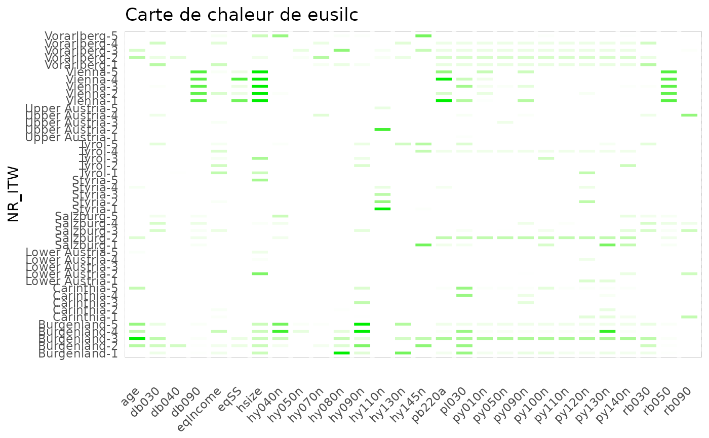
df_stats_eusilc %>%
  filter(stat == 'chi2') %>%
  heatmap_group(threshold = 1, color = "purple2") +
  ggtitle("Heatmap of eusilc chi²")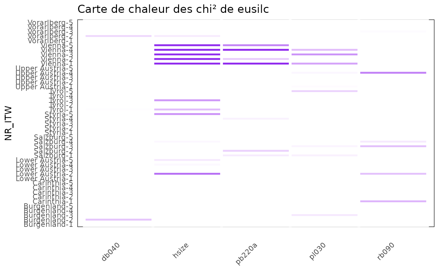
You can also zoom into the heatmap, again by filtering the data.frame
produced by prepa_stats. Here are the three examples used
in the interactive interface:
threshold <- 3

df_stats_eusilc %>%
  group_by(NR_ITW) %>%
  filter(max(abs(standard), na.rm = TRUE) > threshold) %>%
  ungroup() %>%
  heatmap_group(threshold) +
  ggtitle("Zoom on rows")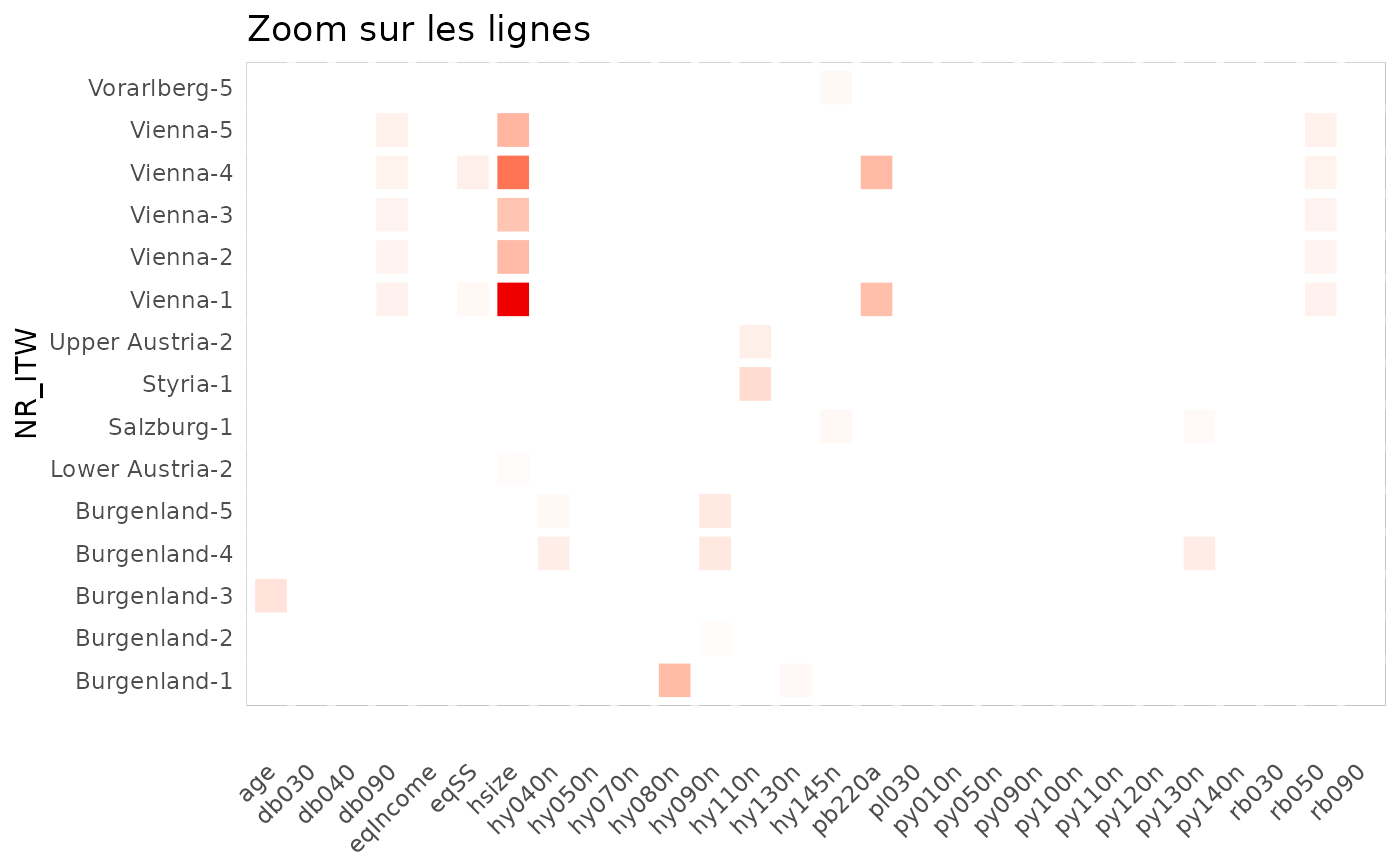
df_stats_eusilc %>%
  group_by(variable) %>%
  filter(max(abs(standard), na.rm = TRUE) > threshold) %>%
  ungroup() %>%
  heatmap_group(threshold) +
  ggtitle("Zoom on columns")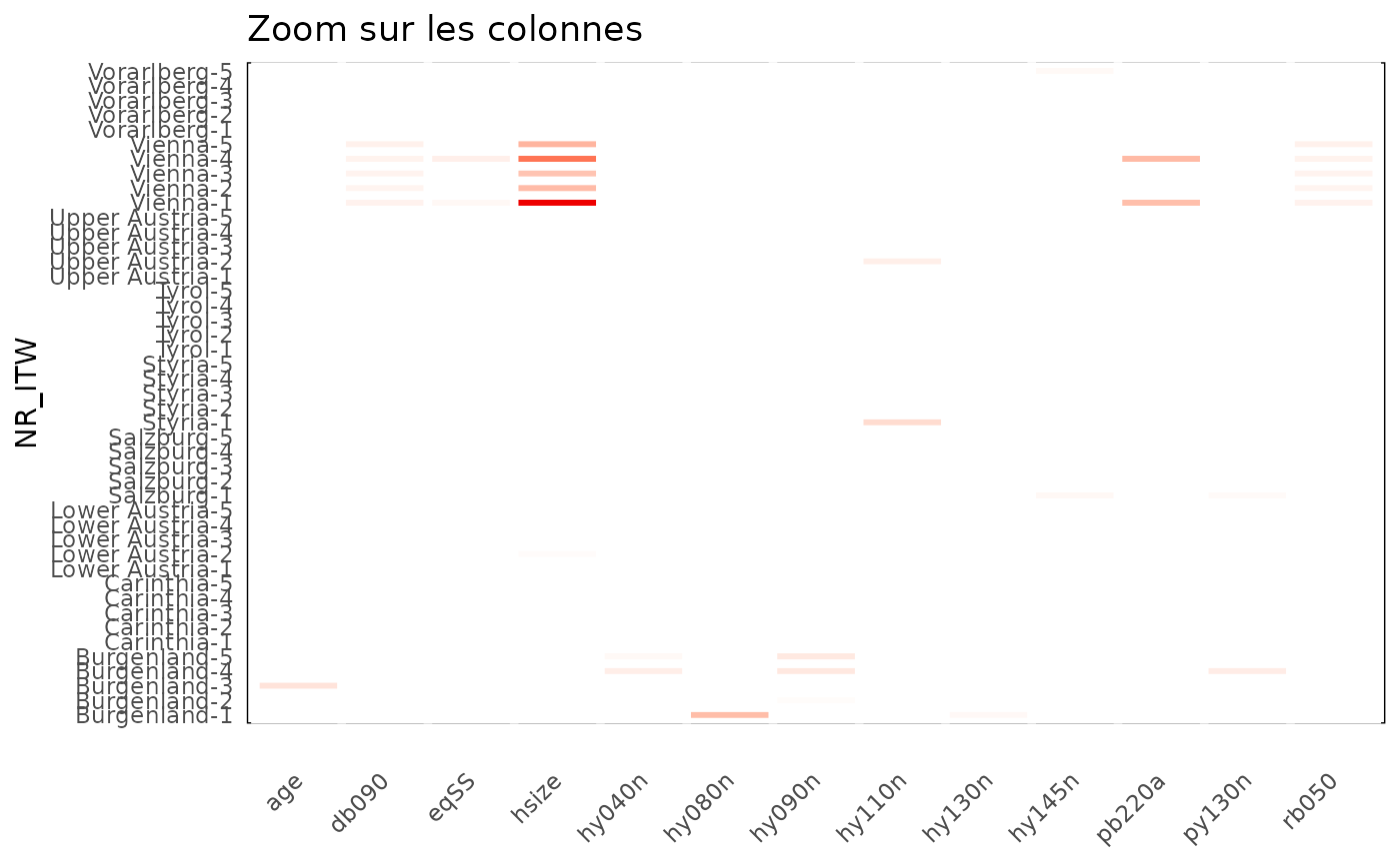
df_stats_eusilc %>%
  group_by(NR_ITW, variable) %>%
  filter(max(abs(standard), na.rm = TRUE) > threshold) %>%
  ungroup() %>%
  heatmap_group(threshold) +
  ggtitle("Zoom on cells")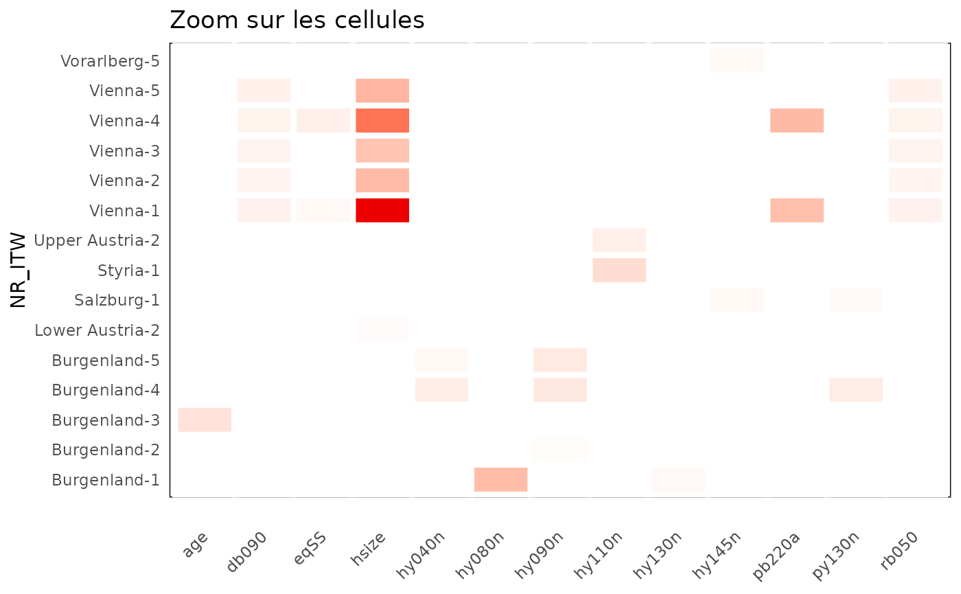
The ggplot object produced by heatmap_group embeds
tooltips that can be activated with {plotly}.
p <- df_stats_eusilc %>%
  heatmap_group(3) +
  ggtitle("Interactive heatmap")

ggplotly(p, tooltip = "text")
score_isoforest(): rank the atypical profiles
The score_isoforest function aims to detect atypical
observations in a multivariate dataset, relying on the Isolation
Forest method. This is an unsupervised learning algorithm,
particularly useful for spotting individuals or records whose profile
differs sharply from the rest of the population. This function is
designed to be applied to a set of numeric variables describing the same
type of statistical unit (here, interviewers), and returns an isolation
score for each observation.
We propose applying the method to the indicators computed for each
variable by the prepa_stats function. For now, we keep the
standardised values of the
for categorical variables and of the medians for continuous variables.
The score_isoforest function requires a wide file, so we
pivot the indicators before applying it.
df_prepa <- df_stats_eusilc %>%
  filter(stat %in% c("chi2", "median")) %>%
  select(NR_ITW, variable, standard) %>%
  pivot_wider(
    id_cols = NR_ITW,
    names_from = variable,
    values_from = standard
  ) %>%
  column_to_rownames(var = "NR_ITW")

head(sort(score_isoforest(df_prepa), decreasing = T))
#>     Vienna-4     Vienna-1 Burgenland-3     Vienna-3     Vienna-5 Burgenland-2
#>    0.6049549    0.5993725    0.5766785    0.5636250    0.5594056    0.5437896
hist(score_isoforest(df_prepa))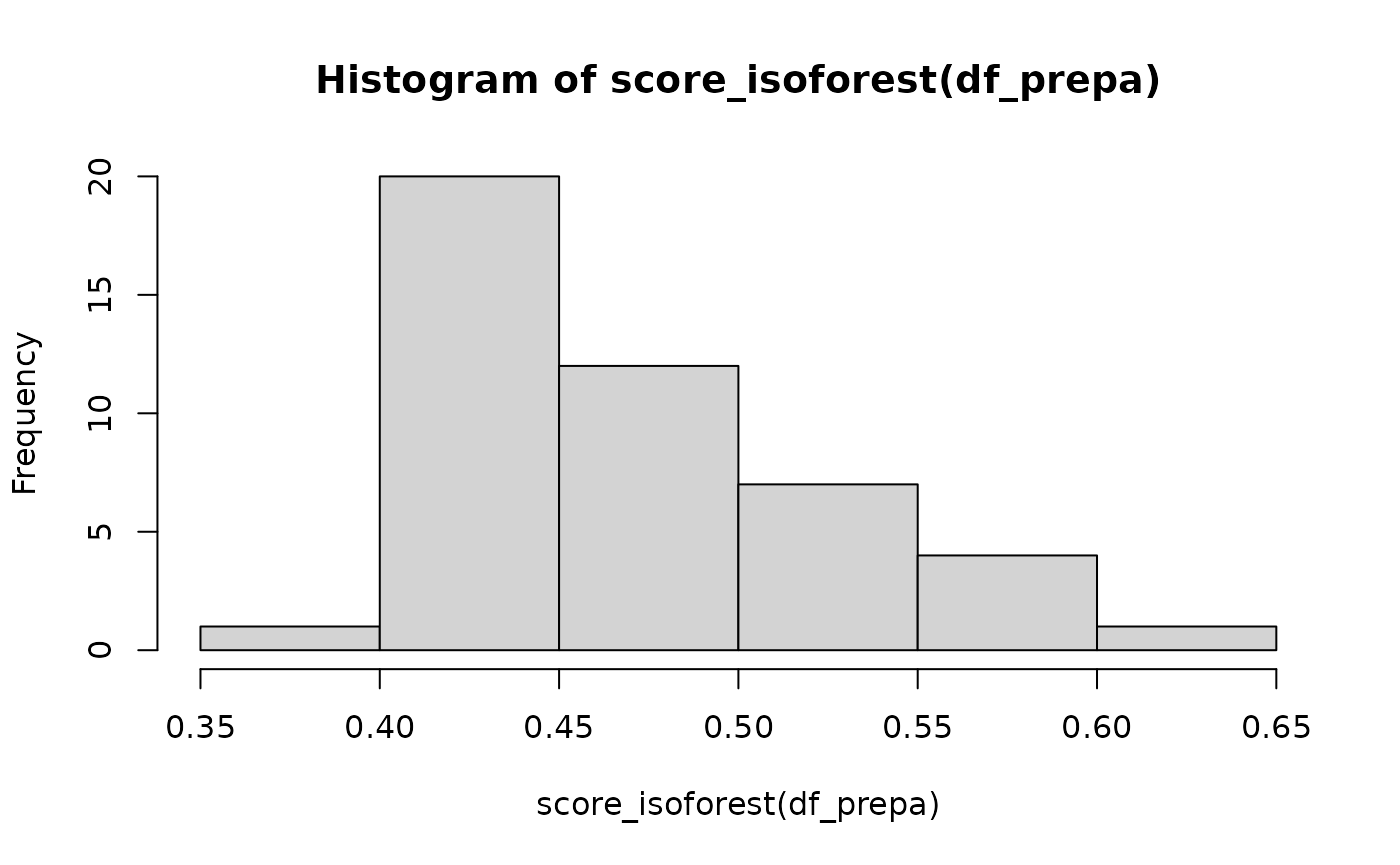
If an optional interviewer summary file has been supplied (one row per interviewer, see the first vignette), its standardised indicators are appended as additional columns to this wide table, so that interviewer-level anomalies (for example an unusually short average interview duration or an extreme response rate) are scored together with the distributional ones.
We again find the interviewers from the province of Vienna coming out on top. A threshold of 0.5 seems acceptable to decide that a score reveals an anomaly, according to this article. Once again, {vizsurvey} does not aim to propose a single threshold, but rather a ranking to guide the investigation.
Conclusion
All the functions presented in this vignette rest on a simple idea: make the weak signals in survey data visible, without over-interpreting them. By combining robust indicators (interquartile ranges, , isolation scores) and intuitive visual representations (heatmaps, rankings), the tool makes it possible to quickly spot unexpected gaps, whether they are due to data-entry problems, interpretation errors, context effects or real phenomena.
The goal of {vizsurvey} is also collaborative. By documenting the formulas and making the methods transparent, we want to encourage discussion around the monitoring of survey data, share good practices and pave the way for collective improvements. The methodological choices presented here are not a definitive standard, and will evolve based on feedback on the package.