R/visu.R
heatmap_group.Rd
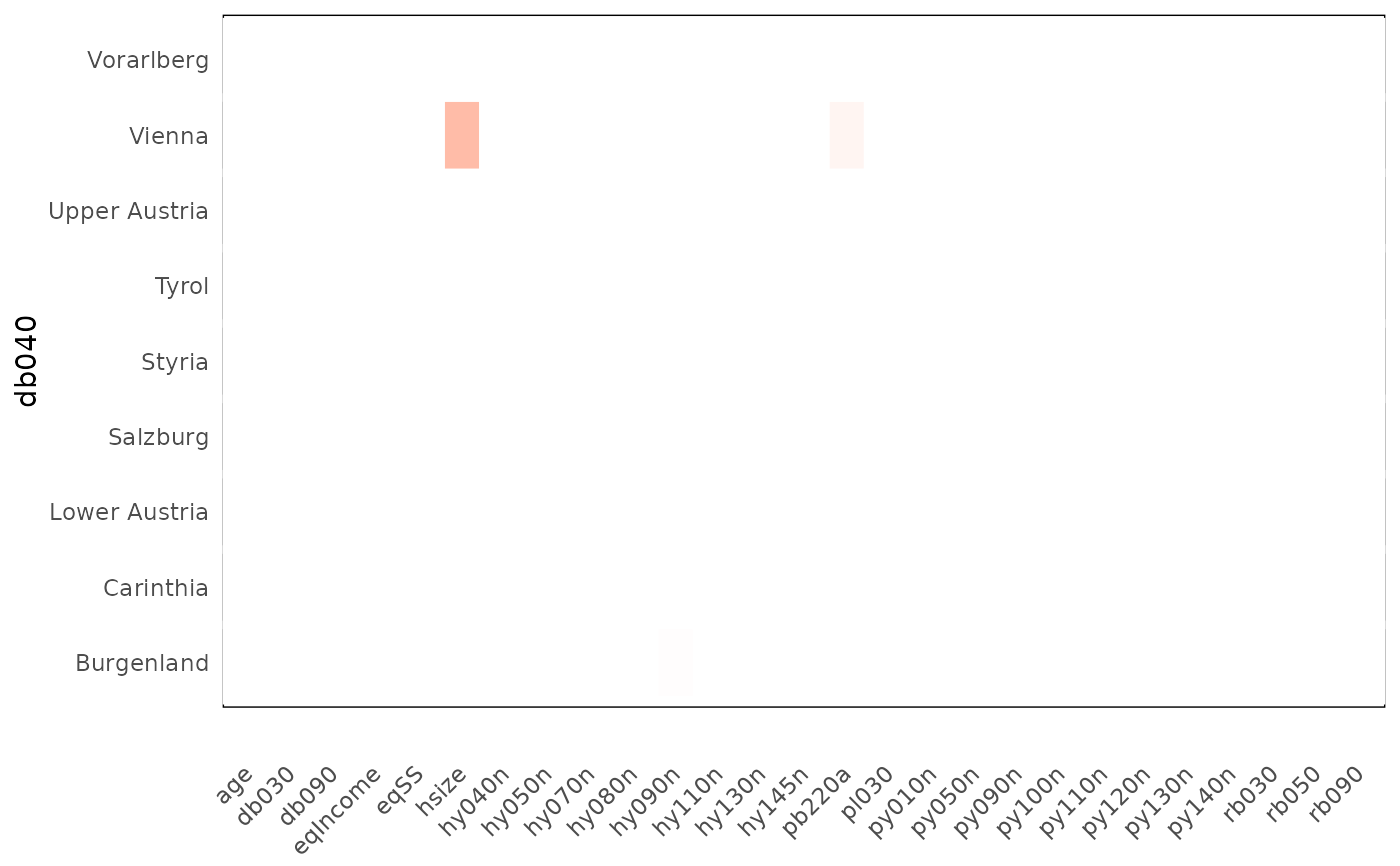
Create a heatmap
heatmap_group(df_stats, threshold = 5, color = "red2")
data frame from prepa_stats function
threshold to show difference
color of the cells
heatmap (ggplot)
library(laeken)
data(eusilc)

df_stats <- prepa_stats(eusilc, "db040")
heatmap_group(df_stats, 5)